CZ Component Library
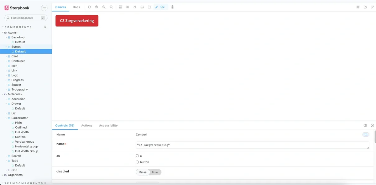
While building the vergoedingen platform for CZ, I also worked on the component library underneath it: reusable React components, documented in Storybook and integrated with the CZ design system.
The goal was a library that outlives one project. Buttons, form elements and the grid system were built once, made accessible, and reused across future CZ applications.
- Reusable React components, from buttons and form elements to a full grid system
- Storybook documentation so designers and developers work from the same source
- Accessibility per component: keyboard navigation, semantics and contrast built in
- Design system integration, keeping every CZ application consistent